City of Time Lost
In 1986, a young Steve Rude faxed pencil art from his Jonny Quest story to Alex Toth for feedback. Toth — who had designed the characters for the 1964 animated series — responded with a scorched-earth hand-written critique. Copies circulated among pros for years before being posted online in 2006. Rude replied in print in Draw! #11 (May 2005).
Click any page image below to see Toth's hand-written fax. Selected pages include a See the process of pencil, inked original art, and printed color phases. This article also has high-resolution original art and the complete printed story.
Dave Marshall, keystroking Toth letters from the school they tore down to build the old school
Page 1 of 12
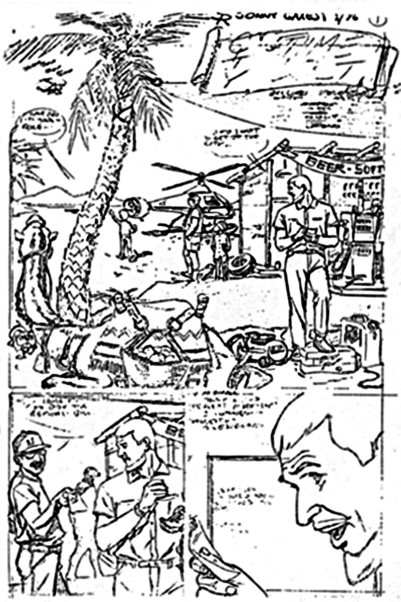
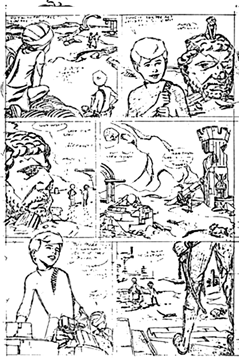
Splash: I won't mince words! You're too good to be so bad! Right up front! Your 'Quest' splash is fake everything! From palm tree, camel (!?), tarp, supplies, 'copter, shack, pumps, incidental props! Terrain, etc. You could have researched the lot (since it was your story's setting) via photobooks, mags, like National Geographic, etc., etc., and your library or bookshop! The fakery's so obvious, in the most important splash, that it detracts from what follows — you cripple credibility at the start (yours! And the story's!) by sloughing off the setting and integrity of your depiction of it. Christ, man, you weren't asked to depict another planet! Just (what I assume to be) North Africa or the Middle East — (I can't read your copy!) — So why didn't you document the locale?! Authenticate it?! Or, fake it, one helluvalot better!
RE all this — and your odd diminution of the characters' importance by placing them so poorly (except for Jonny's dad) — Jonny's hardly identifiable, so far away, and his back to us (!!) and Tina Haaji and the pudgy guy with him; testing our eyesight, perhaps?
Look — this scene's meant to set up our cast, close enough, and posed, so as to be identifiable! Also to establish just where the Hell we are! Thinking comes first, steve — then drawing — to tell the story — intrigue the reader — delight, surprise, edify, inform, entertain him; in the context of the story! Tell the story, man! Don't throw away your opening shot! Your intro to all our key characters! Think! if you must fake what you don't know, do it better, be more clever about it, or don't fake! it's not difficult to get what you need to research a story! Do it!
I think you slapped out the splash with too little thought or care — and I don't understand it, kiddo! it wouldn't have been much tougher to do it right! it would've made drawing it more interesting for you, for the story, for the reader — you — and they — would've learnt something! About camels, their gear, the Oasis(?!), the two 'copters, and the safari gear layed out and the terrain, its heat, fauna (palm trees, etc.) of that region! You just threw out all the pictorial interest native to that locale — and substituted nondescript fakery! You don't realize that your sets/locals are vital to the whole job!
Steve Rude says... Going from memory now on Alex's responses, I remember Alex being upset about not showing the main characters more up front. Since my story was basically a continuation of what Doug had done in the first half of the book, Doug had already done the introduction shots of all the regulars, though Alex wasn't aware of this context. (I informed Alex of this, but he just got more mad.)
in any case, I went for an establishing shot, however small some of the mains were. The dialogue was set-up to focus on Dr. Quest and the filling-station agent, so I kept the good Doctor more front and center than Jonny or Race. I did research on all the items on the first panel. There was nothing "faked".
Page 2 of 12
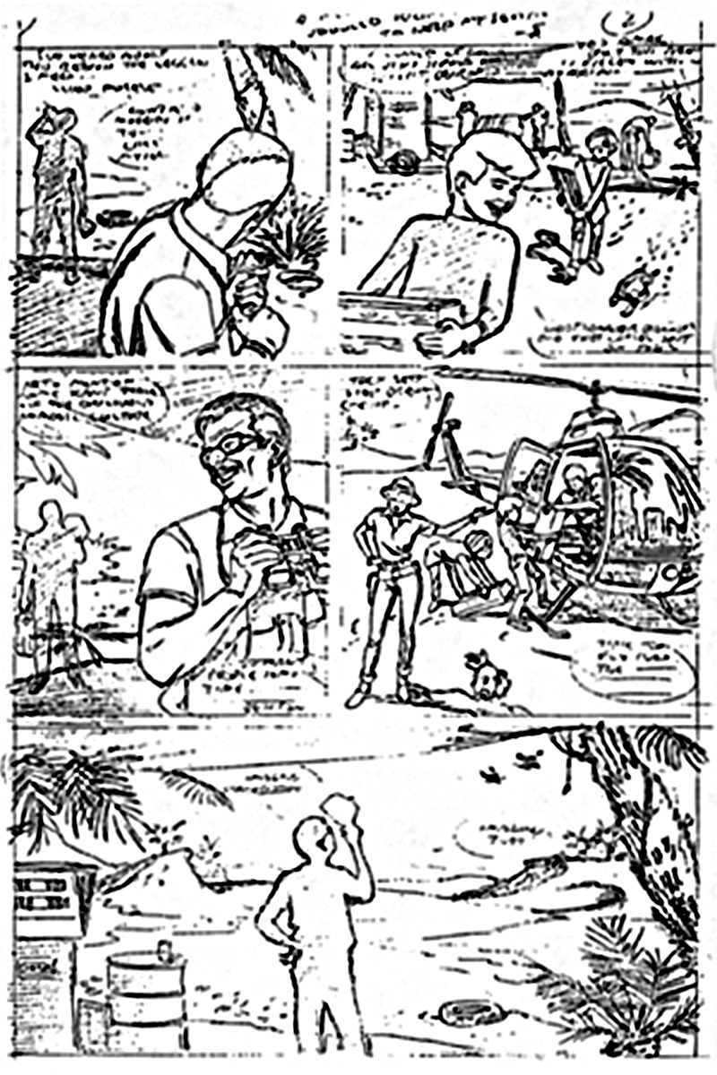
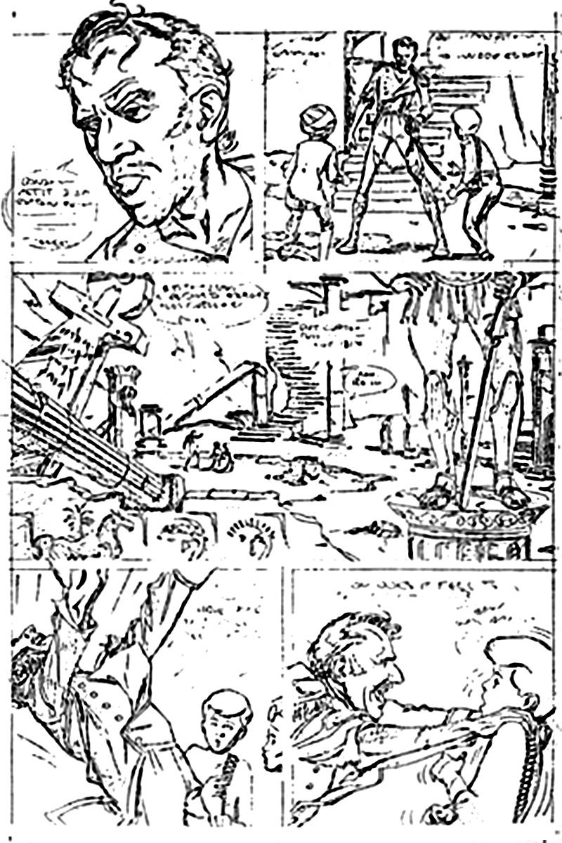
Panel 1: Who's the silhouetted guy in the background, and why is HE important?
Panel 2: Faked background, figures, confuse, don't reveal any story point or 'local color' — and when did you last lift a heavy box? Jonny and Haaji are not carrying them as if they held weight!
Panel 3: More of our mysterious background man in silhouette! Why? Who is he? Should we care? You make me wonder — and if I'm not meant to wonder, then you've distracted me from what I should've seen first and understood straight away, and you failed as a proper storyteller! You don't think!
Panel 4: Who's the woman? Where the Hell did she pop out from? is she important? Why don't we establish/intro her face/identity, clearly — if she is important, that is —? Faked Jonny/Haaji/'copter — (ye gods!) — poses of work!
Panel 5: All fake, foreground to background — silhouetted nobody, tiny 'copters.
Steve Rude says... I don't remember if the use of silhouettes bothered Alex, but considering the career he made of using them, one would have to wonder. I wouldn't put people in the dark if they hadn't already been clearly established visually, unless one was going for a mystery effect.
Page 3 of 12
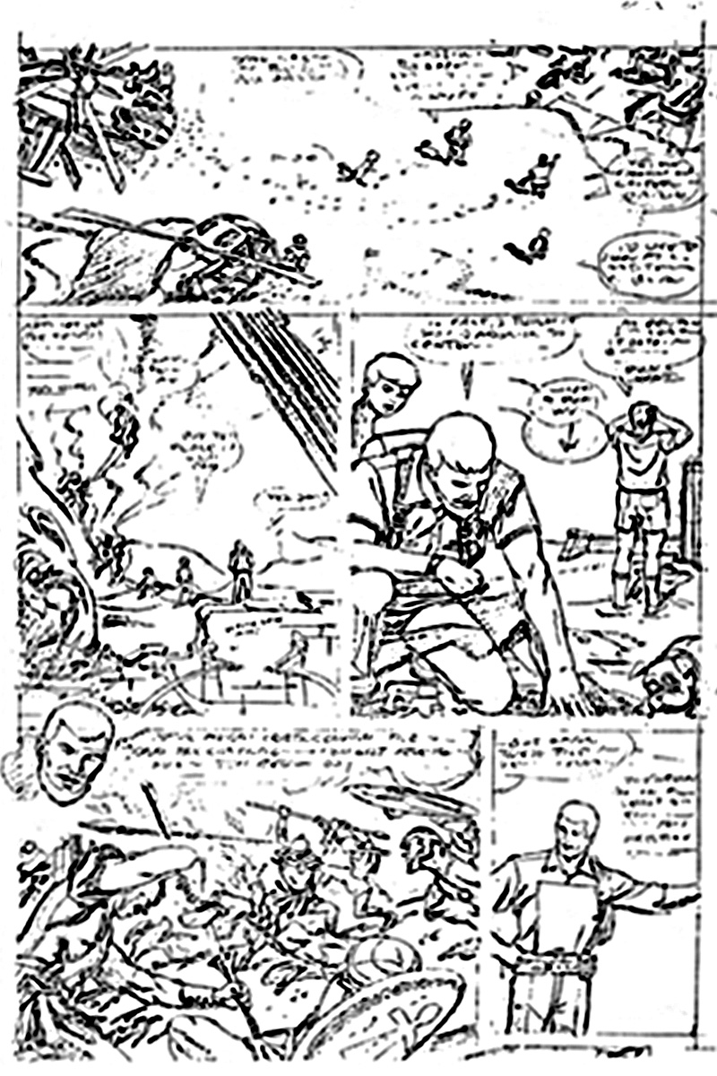
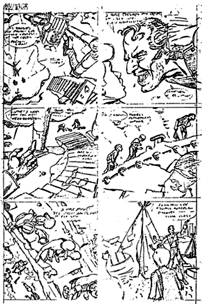
Panel 1: Tiny figures/unidentifiable/faked 'copters worsened by 3 different perspective here — all out of whack!
Panel 2: More tiny figures! Fake! Where the Hell's Jonny, our hero? Shame on you!
Panel 3: There he is! Squeezed him in, did you? But again, who's Pudgy, with his back to us? Why can't WE see what the Doctor's bending to see? it's off-camera! Why? Show it! Bad!
Panel 4: Okay — I guess —
Panel 5: Where's Jonny? Why cheat our other leads out of the shot?
Steve Rude says... I remember him ranting about "tiny figures" alot. I wondered why. The characters were now in a new location, and that's usually when a new establishing shot is the best option. I could've made them bigger in several panels and sacrificed the wide location shot, but is it worth someone getting that enraged over?
Page 4 of 12
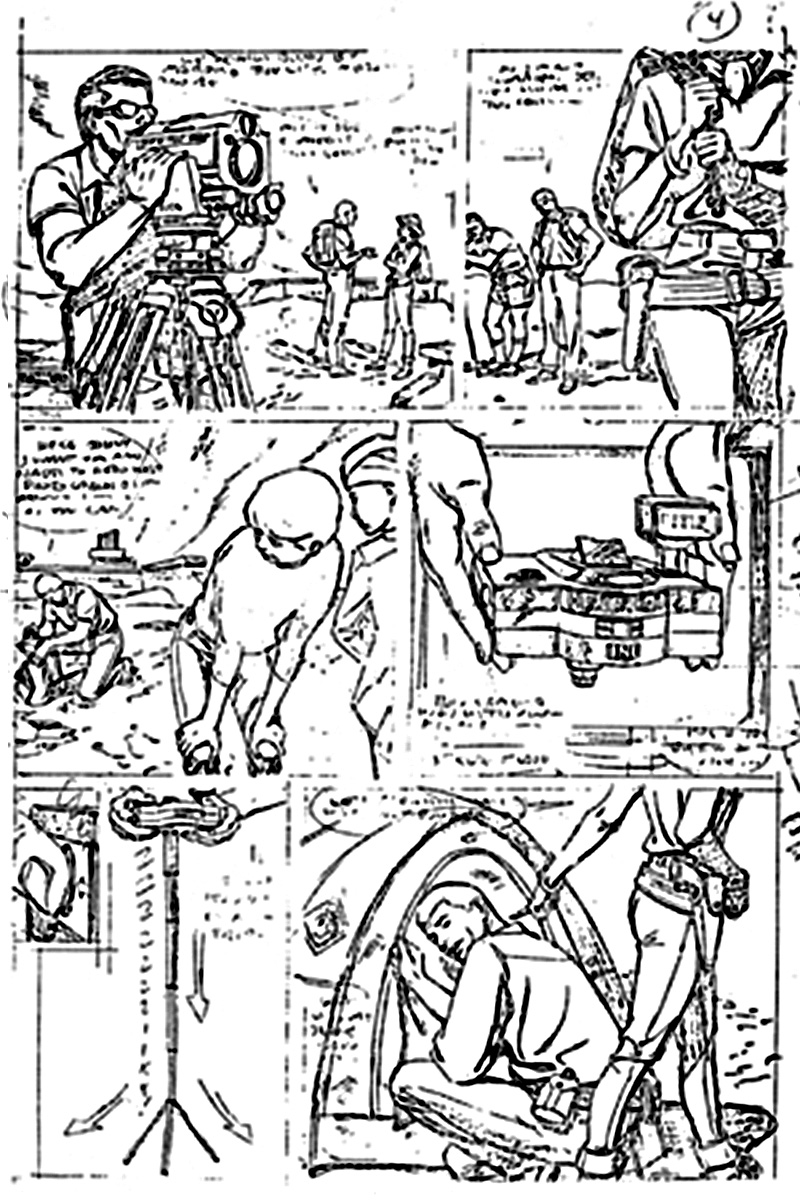
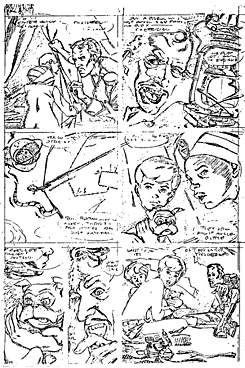
Panel 1: What the Hell kind of camera and tripod iS this? Fake! Who's the guy behind it? Why's she hiding? Who's the gal? We've not yet seen her face clearly! She's with our 'keys' (principals) in the Boonies, but always in the background, or as in —
Panel 2: with her face off-camera!!!! Why?!? Damn it!! Why? You call this storytelling?! You're not thinking! Why is her holster empty here, but filled with gun in Panel 6? (Perhaps your unreadable copy might've explained this!?)
Panel 3: Good pose on Jonny, but you've cheated his face down/back, so is unclear — only his hair (color) and turtleneck identify him — I know that — will a new reader have to figure it out?
Panel 4: I pass!
Panel 5: I pass (Tripods telescope in reverse of your item!) I'm GUESSING that this is a remote-controlled or self-timed 360-degree rotating panoramic camera — but why the flash unit on it? it serves no purpose by day, or night! Too small and just plain wrong! Fake! — (I'm a camera buff, Steve!)
Panel 6: So's this shot — a photographer's 'blind'? Well, maybe so! but, again, WHY don't we see/identify this gal's FACE?!!?
Steve Rude says... Camera-expert Alex had a problem when he saw the "camera" on the first panel. When I called him to explain that it was not a camera at all, but a state-of-the-art surveying device, he just got mad again.
The actual camera used on Panel 4, was given to me by a good friend who worked at a camera shop. In the last panel, Jade could've been shown more upfront instead of the cropping I used. I probably didn't need to crop her twice! I remember trying to experiment with her seductive body language, independent of anything her face may've registered.
Page 5 of 12
Panel 2: At last, Jonny — overpowered by out-of-the-blue-antiquity not established in previous shots of the new setting — lousy unthinking storytelling!
Panel 3: Why is this sculpture so damned important? To you? To the leads? To the story? I think not! You've shrunk our leads for this slight shift of view of iT, for no good reason!
Panel 4: Again — tiny, near-invisible figures! Fake ruins! Confusion, distraction, senseless, unfocused framing!
Panel 5: Fine Jonny — but confusing object he's leaning on! A well? Old stonework? I can't be sure? Can you? Ever see centuries' old stonework, in photos, films, in the REAL world? it ages, man! it erodes in deserts, in weather, wind, rain, sun's heat, etc., etc., etc. — it's rough, pitted, performed, and very interesting — in close-ups! You've failed to make use of it — didn't research it — didn't think!
Panel 6: Tiny figures again — poor foreground figure (silhouette or not?)
Steve Rude says... Did anyone have a problem with this page? Aside from the coloring, which I thought all but ruined the entire story, it reads fine. It's OK, I've long forgiven Matt for it.
Page 6 of 12
Panel 1: No teeth? No eyes?
Panel 2: Back views of our heroes again! Confusing background!
Panel 3: Tiny, tiny, nothing, faked figures! No focus, no real center, to this mishmosh!
Panel 4: Pass
Panel 5: Pass (but this guy doesn't match with his Panel 1 face!)
Steve Rude says... This page was authenticly researched, in as much time as I had to do it. I normally spend as much time on research as the actually pencilling. Bill Loebs, the writer, is a history expert. I assumed he would've mentioned any inconsistencies.
Page 7 of 12
Panel 1: Tiny, fake figures — confusing, pointless downshot!
Panel 2: Face changes panel to panel!
Panel 3: Fake! tiny heroes again!
Panel 4: Tiny — but passable —
Panel 5: Unconvincing/confusing downshot/can't 'read' what's below! Skeletons? Too tiny! Unclear!
Panel 6: Fake — all of it! Every really LOOK at a turban? See how it's wound around a head? Is that a teepee/wigwam in the background? Are we in the 1800's west?
Steve Rude says... The 180-degree rule looks fairly intact here. Anyone get thrown into a different universe reading this page?
Page 8 of 12
Panel 1: Pass
Panel 2: Pass
Panel 3: What the Hell's goin' on here?!! Downshot's wrong
Panel 4: Pass
Panel 5: Pass
Panel 6: Pass
Panel 7: Confusing — poor background figure — black overlaps, etc.
Steve Rude says... Did Alex have any objections about this page? I don't recall.
Page 9 of 12
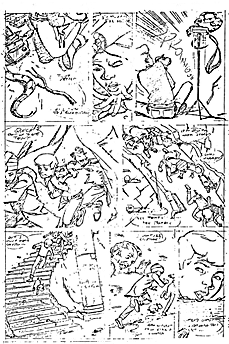
Panel 1: Your downshots never fail to confuse and confound the eye! Clarify! Don't confuse!
Panel 2: Pass
Panel 3: Another damned back view Jonny! Dammit! And where the Hell did the pop-up tripod/camera come from? You failed to clearly set this up previously!
Panel 4: Your blacks only confuse figures' overlaps more!
Panel 5: Damn! Running the wrong way on that bridge — they CAME iN that way (Left to Right) — You don't think!
Panel 6: This directional switch confuses more again — but IS surprisingly CORRECT! IF you reverse Panel 5!
Panel 7: You've reversed it again! Wrongly!
Panel 8: Ditto —
Steve Rude says... Is the one I remembering Alex getting so crazy over because of the "180-degree" rule. I eventually came to define this rule as applying far more to film than comics. In films, it's critical to the directional continuity; in comics, because it's seen in the context of a whole page of panels, it is not as critical. I threw the rule aside in one panel to show the pandemonium of the situation starting with the snake, and the highly agitated Frenchman who was beginning to lose his mind thru paranoia. Probably the better question to ask is, did it cause any readers to stop reading, and boldly incite a violation in screen direction? Just curious.
Page 10 of 12
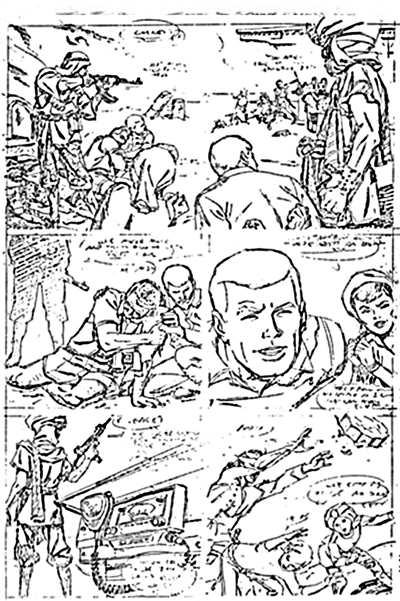
Panel 1: Oh, terrific! More unidentifiable tiny figures of our heroes in the background! and more GD back view of equally unidentifiable figures in unclear, awkward poses on ground! if they're TiED UP, then damn it, SHOW THAT!! Your natives' garb are fake! Where'd the woman in her babushka or kerchief come from? Who/what is she? Do you care? I don't at This stage of confusion!
Panel 2: Who's face are you hiding now? The guy in specs! Who is he? Didn't you get enough Hanna-Barbera model sheets?
Panel 3: Where did Race Bannon come from? Who's the gal? is she in a beret now? Where are we? What's goin' on?
Panel 4: I don't know where this radio set is! You didn't set it up previously — didn't think! Ahead — or back — to adjust, change, have it all tie together smoothly! if you saw a movie/TV show as poorly-though-out and shot, you'd have fits too — like I am now! Mercy!
Panel 5: Whatever — I can't figure out 'who's on first?!' But the direction of this toss is wrong!
Steve Rude says... Did Alex have a meltdown on this page? Don't remember. Everything looks pretty well established with a long shot, medium shot, close-up of Race, and a partial of Jade, then the set-up for the radio smashing scene on the next page.
Page 11 of 12
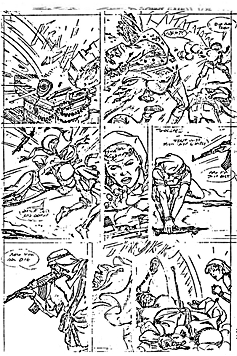
Panel 1: So's this!
Panel 2: Pass — Hell, I don't know, nore care, anymore!
Panel 3: So —?
Panel 4: ?
Panel 5: Okay, I suppose (but MG's at hip-level, as shown)
Panel 6: And here, needlessly hoisted up to eye-level to blow away the gal right in front of/and below the baddie, no sense to this at all — it's a RiFLE POSE. without cause — as an MG is a SPRAY weapon — at close or far range!
Panel 7: I can't 'read' all your black art — can you?
Panel 8: You've thoughtlessly reversed figure positions, so have destroyed action flow/followthrough here, in sequence! You don't understand visual continuity or directional flow at all! I'm amazed! Look, THINK! Once you've set up figures on left and right for a sequence like this, keep left LEFT and right RIGHT! Orientation of all key figures will keep the action going in the proper and SAME direction. This is called action flow/directional flow/followthrough! Verstehst du?
if you'd THiNK MORE, HALF your work'd be DONE for you! You keep shooting yourself in the foot! And DESTROY your tentative visual continuity! Don't you study movies/TV and NOTICE these things? When it's right, when it's wrong — and WHY it is?!
Steve Rude says... Alex pointed out that the weapon was a "spray weapon" and would not have needed to be positioned thus. He was right, which I was glad he pointed out. I probabaly felt conditioned to do it for the "moment before" suspense. My error.
Page 12 of 12
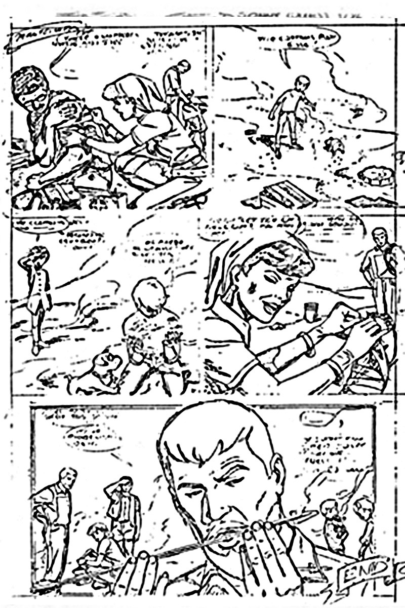
Panel 1: 'Spec's' head's down again —?! Who iS this gal?! is she the one in the pith helmet way back at the beginning of all this confusion?
Panel 2: Pass
Panel 3: Pass
Panel 4: What's she doing?
Panel 5: More tiny figures — I give up!
Steve Rude says... I probably would've showed the Arab Doctors face more on Panel 4, but that's all I can think of here.
Closing Words
it you didn't have talent, I wouldn't give you 3 minutes' sweat at this, Steve — But I think you've cheated and faked your way through this whole story! As if you didn't CARE enough to think ANY of it THROUGH!
A few well-drawn figures in 12 pages doesn't cut it, kiddo! Since you asked, I gave you the Critique — if you're pissed, I'm sorry! but I'm dismayed that you don't concern yourself with what is vital/important to any story you do, to do it RIGHT — or NOT do it AT ALL!
Forget technique, tricks, cheating, faking and concentrate on how to tell a story as it should be told!
Clarify! Reveal! Don't conceal! Don't confuse! Show! Explain! Simplify! Economize! Open up areas! Don't clutter! And for God's sake, if you don't know about a subject you must draw, then find out! You'll learn! so will your readers! Once drawn, you'll keep memory of it — so years later, you'll recall it, if need be — photos help document/authenticate subjects, people, places, things and we're swarming with sources for such info — there's no excuse for not using it — camels and palm trees and 'copters and deserts and costumes are infinitely varied — their differing types provide you with pictorial fun and interest — ditto your readers! USE it! Learn!
Think! Think! Think!
Before you draw, while you draw — and AFTER — and REDRAW, if it doesn't work — be honest with yourself! And your readers! Stop faking! You don't know enough to do it well, so don't! Learn! See! Observe!
I'm old fashioned, but I don't comprehend your (and too many other young cartoonists') disdain for designing all your captions and dialogue balloons' exact shape/size/positions in every panel and page — and CLEARLY pencilling in legible readable copy!?
I always did, and DO — as did most of my generation of crocks! You're missing half the fun (and ALL of the responsibility!) by throwing that part of your job away, too! Copy, in strips, as in all graphic/aural media, is of vital importance, and part of overall design! it CONTROLS your readers' eyeflow, through your panels, up, dow, around and pages! Why fob it off on a letterer who'll care less, know less, about such vital components and who may just mess it up more? I don't get it!
The logo (title) placement's very important, too, and if you're given a 'Jonny Quest' stat for paste-up, or design your own, plus the story (episode) title, that's YOUR job!
You've played fast and loose with this too! Disappointing! You don't care!
Or do you?
As it is, I don't see our title here 'Jonny Quest' in all of this splash page — just the back view of a kid who might be him, unimportantly sized and positioned and posed — for a first-time reader to see this page, he'd wonder which character was the hero?
You give more importance to an incidental character in Panel 2, than Jonny in the splash? Why? And who's the guy in the background? Study staging, in films/TV and YES, the stage!
And remember!
And Keep Doing This All Your Productive Life!
Always be a STUDENT! A scholar! Admitting to how little you know, how much there's still left to learn, is your KEY to learning! For a lifetime!
Study everything! Be curious/interested/in everything, you may have to draw it someday! You can't draw something credibly until/unless you do/can understand it! And vice versa!
Comic books print the WORST just art! 99% of it is cheap, vulgar, ignorant, ugly, senseless fakery and trickery of characterless hue — if that's ALL you want, just do what you're doing — you'll be a mite better than the REST, but that won't be much!
Your growth is in your hands, not mine!
I hate giving critiques — an emotional drain! They anger me! And those I critique! Like you! if you're angry — don't waste it on me! Be angry with YOU! YOU are in YOUR OWN HANDS, like clay waiting to be formed — you must ALWAYS be your OWN best teacher! Not me! I refuse that — unless I hold classes!
No old pro, no teacher, no school, no book, no how-to film/casette will EVER teach YOU as well as you can and must. But they help you to think!
To DO that, you must be AWARE! Not smug, or complacent, or cocky, or relaxed about how good you are! You've used 10% of your THINKING skills thus far — you've got 90% left! For the rest of your career and life! HOW MUCH of it will you USE?
Forget all the fandom bullshit and kudos and hype and convention groupies' adulation — and be true to yourself and your long road ahead to the top, or to wherever you want to go — and don't let ego stop you from learning to do BETTER, BEST!
That's all, kiddo! Study our old masters of art, sculpture, illustration, strips, film, of the last 100 years and beyond, here and abroad!
— Alex Toth
Steve Rude says... Oh, when I did receive Alex's letter, I called him. It started out nicely enough, but when I attempted to explain the things I felt him in error about, he let out a few curse words and hung up. That's what I recall of this situation. If it helps people to learn from my mistakes, then all the better.
